- Revenue Diaries
- Posts
- Revenue Diaries Entry 61
Hey everyone. Quick apology for missing last week. January showed up with a full calendar and very little patience. Haha, between family, annual planning, executive off-sites, and a brand launch, things moved fast, and I didn’t have the energy to write last week.
We’re back this week with FIRRREEEE, because I’m amped from the new brand launch at Docebo. I wanted to use this edition to explain why we did so.
Over the next few weeks, I’ll dig into the process itself. The thinking, the tradeoffs, the frameworks, and the launch strategy. Give you some content to use and peruse. That’s why we are here, right?
For today, it is about the why. Why we revisited tone and voice. Why color and visual language mattered. Why now felt like the right moment.
If you work in brand or content, I hope this resonates. Glad to be back in your inbox. We’ll talk next Sunday.
♥️ kyle
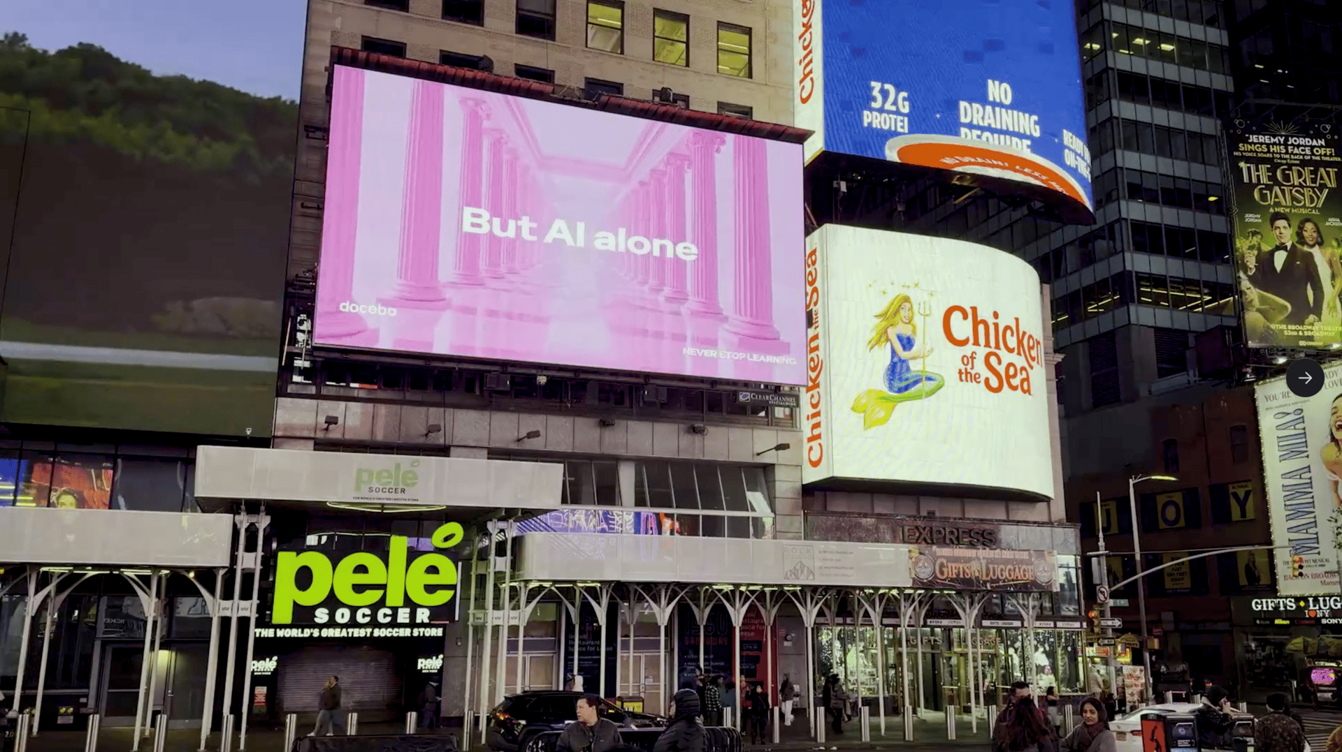
24 Hour Times Square OOH
On Why Should You Rebrand? Docebo Use Case
There’s a familiar rhythm to marketing careers. A new leader arrives, and a rebrand soon follows. I understand the skepticism. When I joined Docebo, the instinct to revisit the brand did surface quickly, but not for personal reasons. The gap between who we are and how we showed up in the market had simply grown too wide to ignore.
Learning is a noisy space. LMS, LXP, skills intelligence, workforce intelligence. Blah. Blah. Blah. Walk a tradeshow floor and try to tell the brands apart. The language overlaps. Everyone is a leader. Everyone is number one. Docebo was part of that blur. The brand no longer reflects the role we actually play, or the urgency organizations are living with right now.
Work is changing faster than the systems designed to support it. That change isn’t abstract anymore. AI is already embedded in daily workflows, and as access to tools expands, differentiation moves away from technology itself and toward whether people can actually use what they have. Adoption, application, and adaptation matter more than features on a slide.
Learning sits directly in the middle of that reality. It always has for Docebo. What changed is the cost of waiting. Expectations are higher. Timelines are shorter. When systems fail to keep up, people feel it first. Our brand needed to reflect that with more clarity and more confidence.
Before any visual work began, we focused on belief. We wrote a manifesto to be precise about what we believe about this moment. Writing forces decisions. It creates a shared reference point that design, messaging, and product can all anchor to. That document shaped everything that followed. Every choice was tested against it. I’ll go deeper on the manifesto and that process in future editions.
While working through it, a simple idea emerged. AI is moving fast, but its impact depends on how people grow alongside it. Learning is no longer a long-range investment or a side initiative. It is how organizations stay ready while work keeps changing in real time. Those conversations and that writing eventually gave us the line that now sits at the center of the brand.
Never Stop Learning.
Never Stop Learning is our Just Do It. It reflects how progress actually happens under constant change. We believe learning is how people keep their skills usable and relevant. It closes the distance between knowing something and being able to act when conditions are shifting underneath you.
The visual identity grew from the same thinking. Docebo has history. Italian roots. A long track record of building serious technology for complex, global organizations. We wanted to respect that foundation while introducing new energy. The direction that emerged pairs classical forms with modern color. Elements that feel established next to ones that feel alive and evolving.
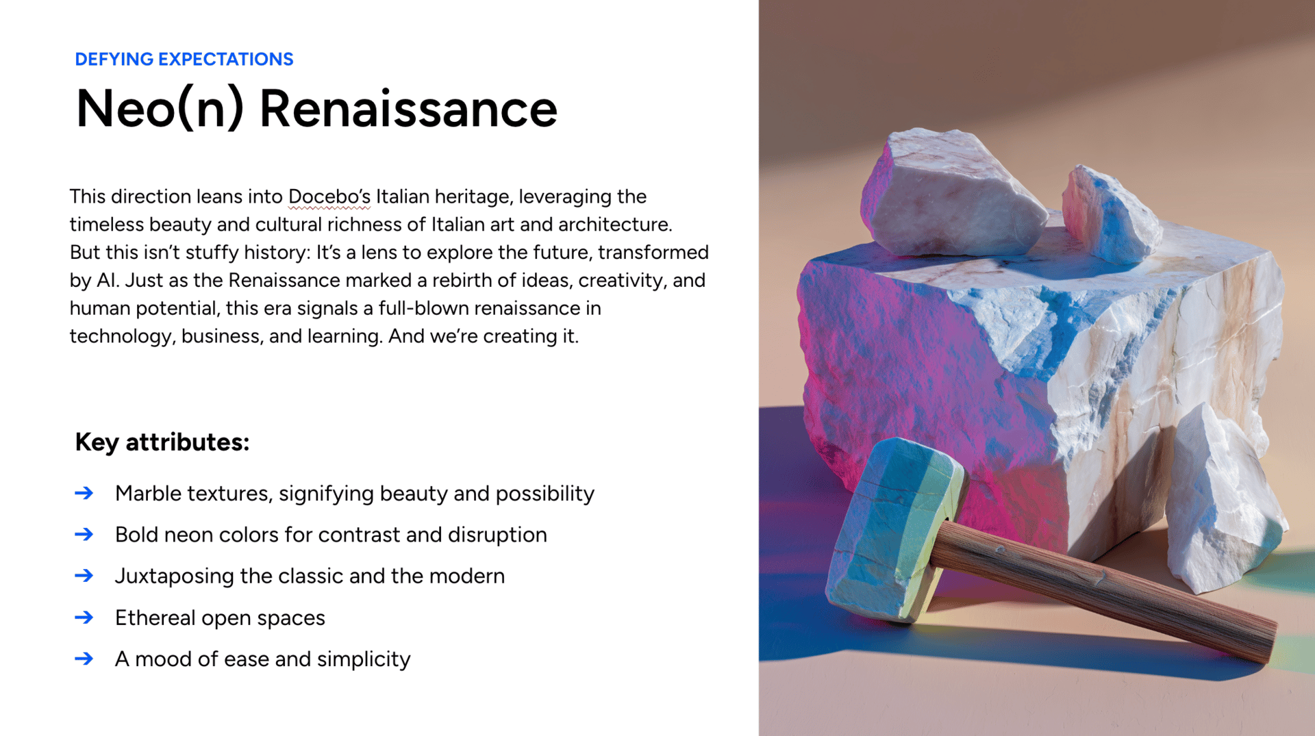
Internally, we refer to this approach as Neo(n) Renaissance. The Renaissance marked periods where new tools expanded human potential rather than diminishing it. The parallel felt relevant. Technology continues to accelerate, but progress still depends on people learning how to use it well.
The system was designed to scale across products, regions, campaigns, and experiences. Consistency comes from shared principles rather than rigid templates. That gives teams flexibility and allows the brand to grow without chasing the trend of the moment.
One of the decisions I feel strongest about is how the work got done. Nearly all of it was developed in-house, with designers, marketers, product teams, customers, and leadership working closely together, plus excellent backend support from HumanMade. It matters because it keeps the work grounded and creates shared ownership. A brand only works when the people behind it understand it, believe in it, and feel connected to it.
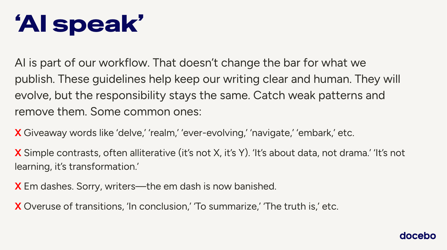
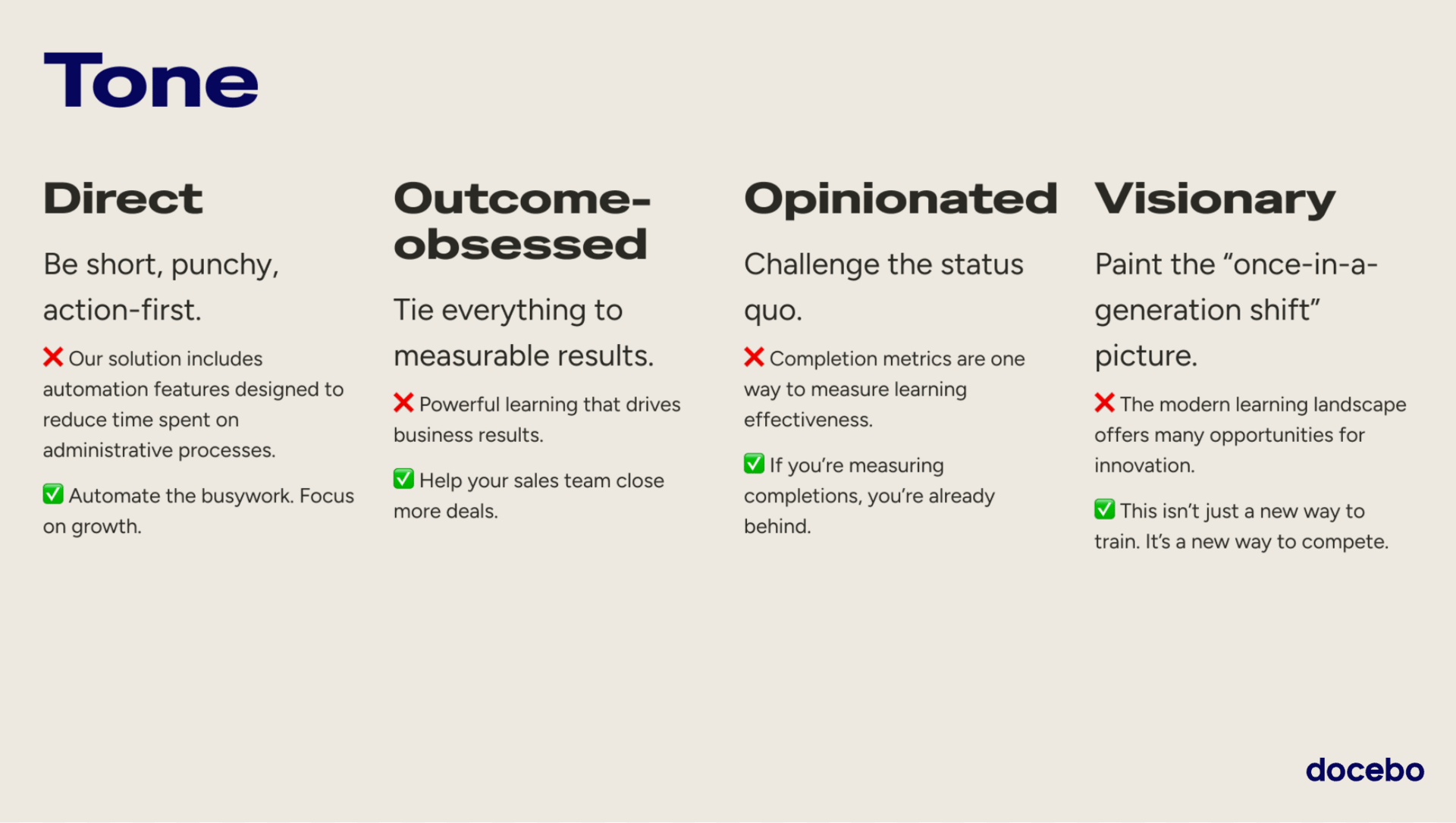
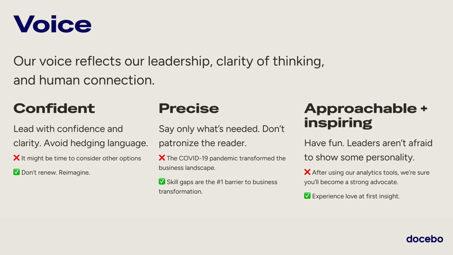
This refresh goes beyond appearance. Tone and voice are evolving alongside the visuals. We are becoming more direct and more comfortable expressing a point of view. Less category language. More clarity about what we believe learning enables.
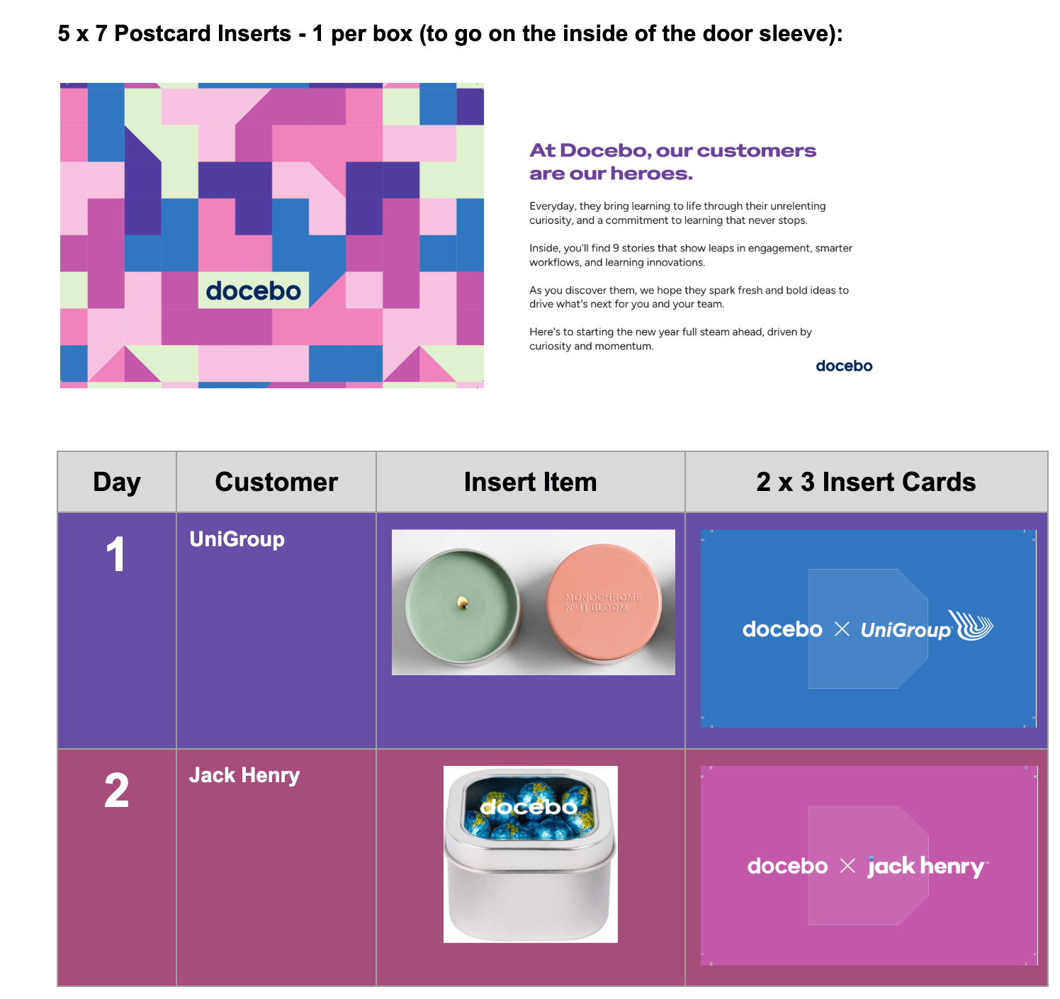
The box included shoutouts to 9 customers
And we wanted to follow up with a cool direct mail campaign that incorporated our customers but also the new brand.
A few weeks after the brand refresh went live, the team shipped something small and very physical. No splashy launch. No big reveal. Just a box that showed up on a handful of desks with a quiet amount of intention behind it.
We called it the 9 Days of Learning. Internally, it was one of those ideas that felt obvious once it existed. Externally, it landed with surprise and curiosity. A sense that someone actually paid attention.
Direct mail has a bad reputation in B2B, and most of it earns that reputation. Generic swag. Logos stamped on objects with no future. If we were going to send something physical into someone’s world, it needed to earn its place there.
The idea was simple. Every object had to mean something.
For Tripadvisor, we sent a luggage tag. A nod to what they’ve built and how they’ve scaled learning globally. A small reminder to keep exploring.
For Denny’s, we sent playing cards. Learning doesn’t always have to be serious. Some of the best moments of connection happen in familiar places.
We sent socks to Orangetheory Fitness, reflecting how consistency and small habits compound over time.
For Definity, we leaned into pride. A Canadian company leading its category and doing meaningful work.
None of these items were expensive. None were flashy. What they shared was thought. Each one connected back to the customer’s reality rather than our pitch.
Marketing has a habit of trying too hard to impress. What actually makes sales easier is simpler. An experience that feels considered, personalized, and thoughtful.
This campaign worked because it didn’t feel like marketing.The same principles behind the brand showed up here too. A system that holds together across formats, whether it’s a website, a keynote, or a box on someone’s desk.
Again, the goal of marketing is to make sales easier. The only way to do that is to stop pitching and start delivering experiences people actually enjoy interacting with. Sometimes it’s enough to say we see you and we put real thought into this.
As with the brand itself, this is part of a larger story. I’ll be sharing more of the process behind how this work gets shaped, tested, and shipped. From the design system to how we measure success, and everything in between.